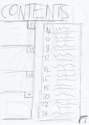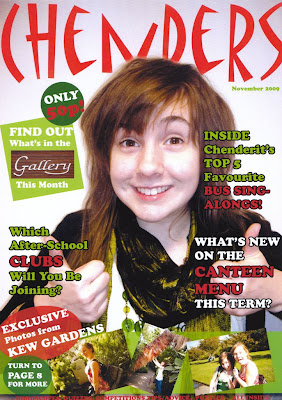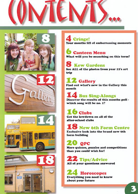

Following on from this, I took the relevant photos around my school before creating the pages using Adobe Photoshop and Adobe InDesign, as the brief requested. My school magazine front cover and contents page is displayed below:-

 Overall I think that I managed to capture the codes and conventions of a real magazine effectively. This is because my magazine cover used a medium close-up shot of the cover star as well as using text over the top of the photo and a strip of smaller photos along the bottom, similar to a real magazine. Furthermore, my contents page uses photos along one side with page numbers on top and then a list with further details and page references, comparable to a real magazine. In addition to this, I think the colour scheme used (green, red and white) fits the target audience (school students) appropriately due to its bright, fun and eye-catching nature. However, one thing that could be improved is the magazine’s heading on the cover; if made slightly bolder and possibly in a different font, it would stand out more and therefore be more successful.
I think my images and their composition fit the intended pages well. This is because the medium close-up shot used on the front cover fills the whole page and has quite a plain background, therefore making it easier to read the text over the top. In addition to this, the colours of the cover stars clothes (green) fit in very well with the text and rest of the magazine. As well as this, the photos from Kew Gardens displayed at the bottom of the front page, fit in well as they are arranged at an angle making them seem more like snapshots and therefore more interesting/eye-catching.
Considering that I’ve never used Adobe InDesign before and barely used Adobe Photoshop, I feel that I have done very well in creating this magazine to a good standard. However, I do need to practise/ work more on my skills for using a desk top publisher before I start my music magazine in order to ensure a professional looking product.
No comments:
Post a Comment