As the main task of my coursework is to create part of a new music magazine, I’ve firstly decided to research NME - one of the oldest music magazines still running.
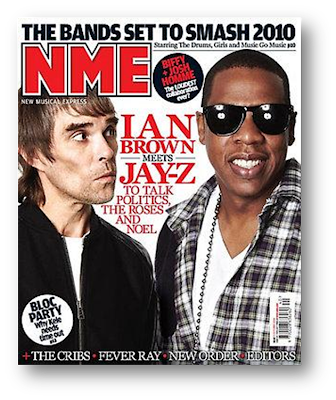
Image Source: www.nme.com/magazine
Introduction
The New Musical Express magazine has been published weekly since 1952. It was the best selling music magazine during the 1970s and currently has a circulation of 40,948 and a readership of 369,000. In addition to this, NME was responsible for creating the UK’s first singles chart and breaking acts such as Jimi Hendrix, Oasis and Arctic Monkeys into the wider world.
The magazine describes itself as “the world’s most recognised and iconic music magazine”, published to give a “truthful, honest, informed account of what’s going down in music”.
Magazine Website:
http://www.nme-magazine.com/The Content of NME
A typical issue of NME is around 70 pages long and focuses on mainly guitar and rock music; Oasis, Arctic Monkeys, Nirvana, The Rolling Stones, The Sex Pistols and many more have all featured in past issues.
The magazine usually starts with a section on “News” which contains some articles and information regarding the recent happenings in the world of music. This is normally followed by interviews and features on specific artists, along with a page for letters from the readers. Further on in NME, there is also a section dedicated to reviews which comments upon new albums, singles and concerts of the week. In addition to this, near the end of the magazine, the pages are filled with adverts for upcoming tours and gigs as well as competitions and a crossword.
The Publishing Institution of NME
NME is currently published by IPC Media, the UK’s leading publisher of consumer magazines and websites. Over 26 million adults read an IPC Media magazine and over 350 million copies are sold each year.
IPC Media Website:
http://www.ipcmedia.com/The Typical Reader ProfileThe average reader of NME is a 24 year old fast-moving music fan who lives at the cutting edge of media culture and development. 69% of the readers of NME are male, with 52% working full-time and 29% still studying. The total readership spends £326 million on audio equipment per year, and typically the reader enjoys going to gigs and other live events in their spare time. The standard reader spends nearly 19 hours per week on the internet. In addition to this, the reader finds clothes and image quite significant; 71% of readers think it’s important to look well dressed, with 45% spending a lot of money on clothes.
Layout Trademarks of NME
Unlike most magazines, NME does not have a contents page, but a band index instead. This alphabetically lists all of the artists featured in the magazine and which page to find them, without giving any further details or information.
The main layout trademark of NME is its similarity to a newspaper throughout most of the magazine. This is particularly evident in the news section, due to the dominant use of the colours black, white and red, along with the bold headlines and articles written in columns. In addition to this, the inside pages of NME have a newspaper feel in comparison to the normal glossy magazine pages used in most other publications.
Another feature of the New Musical Express is its use of a full page photo on some of its articles. Relevant text is then layered over the top of the photo, usually at the bottom of the page. As well as this a coloured rectangle displaying the section of the magazine the reader is viewing e.g. “NEWS”, “LIVE!” etc. is normally displayed at the top of these pages :-
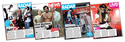
Image Source:
www.nme.com/magazine
Does NME Reflect the Values of its Audiences?
NME manages to match its audience’s values by providing a magazine with up to date articles, photos and information based on the typical music related interests of the reader – live concerts, reports from the music industry and new up and coming artists.
Choice Two: Sugar
The preliminary exercise in my coursework is to produce the front page of a school magazine. Because the audience for this will most likely be teenage, I’ve decided to research Sugar – one of the biggest teenage magazines in the UK.
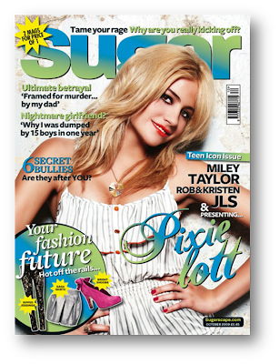
Image Source:
www.sugarscape.com/main-topics/homepage/394958/pixie-lott-cover-sugar?page=13IntroductionSugar is a British monthly teenage magazine currently edited by Annabel Brog. It first launched in September 1994 and within a year it was selling 205,000 copies a month. The magazine currently has a circulation of around 158,000 and has a selling price of £2.45. In 2007 the website
http://www.sugarscape.com/ launched, combining the sugar editorial content with an online community, proving extremely successful.
The Content of Sugar
A typical issue of sugar contains roughly 100 pages and focuses mainly on fashion, celebrities, boys, real life stories and advice. Keira Knightley, Cheryl Cole, Vanessa Hudgens, Avril Lavigne and many more have all featured on the front cover of Sugar in the past.
The magazine usually starts with a contents page, followed by a double page of letters from the readers, polls and competitions. Sugar then continues with a few celebrity gossip articles and a double page on music, films and TV programmes of the month. A detailed interview with the cover star features after this, along with readers embarrassing stories/confessions and some real-life stories. Subsequent to this are several pages based upon current issues affecting teenagers, before numerous pages filled with fashion and beauty. Sugar finishes each issue with daily horoscopes, a problems/advice pages as well as an A-Z of shops to buy from. In addition to this, Sugar magazine comes with a separate magazine known as “Lad Mag” which also has its own celebrity cover star, real-life stories, advice, stories from columnists and posters.
The Publishing Institution of Sugar
Sugar is currently published by Hachette Filipacchi, the largest magazine publisher in the world. Hachette Filipacchi was founded in 1826 and publishes other magazines such as Elle, Red and many more.
Hachette Filipacchi US website:
http://www.hfmus.com/The Typical Reader Profile
The average reader of sugar is female and aged between 12 and 17 years old. She loves watching reality TV programmes such as The X Factor, Britain’s Got Talent and Big Brother and likes to download her favourite music - Leona Lewis, The Jonas Brothers and Rihanna straight onto her mobile phone. In her spare time she enjoys shopping in Topshop, Miss Sixty and Pineapple, as well as instant messaging her friends.
86% of Sugar readers shop online, with 44% spending in excess 9 hours a week online.
Layout Trademarks of Sugar
Different to most magazines, Sugar doesn’t particularly follow a specific layout for each page; each issue and page normally uses different colour schemes, fonts and sizes of headlines. This is most likely done in order to increase its appeal for the younger audience, keeping it fresh, new and exciting, as well as allowing the layout style to change with the latest fashions and trends. In addition to this, Sugar magazine is A5 in size, making it compact and easy to carry around, in comparison to the standard A4 size of most other magazines.
However, certain pages do use similar layouts each issue, but are never exactly the same; the colour scheme is always different. For example the “Write here WRITE NOW!” pages always feature the bold title across the top of the left page, along with a “star letter” double page with some sort of competition next to it. This is one of few pages which has a specific layout.
Does Sugar Reflect the Values of its Audiences?Sugar definitely reflects its audience’s values; it offers something for all teenage interests whether it be fashion and beauty, real-life stories, music, TV and film gossip etc. As well as this, it’s written informally and in a way the teenage audience can relate to. It also displays affordable yet fashionable items and ideas perfect for young adults who don’t have an income.


 Overall I think that I managed to capture the codes and conventions of a real magazine effectively. This is because my magazine cover used a medium close-up shot of the cover star as well as using text over the top of the photo and a strip of smaller photos along the bottom, similar to a real magazine. Furthermore, my contents page uses photos along one side with page numbers on top and then a list with further details and page references, comparable to a real magazine. In addition to this, I think the colour scheme used (green, red and white) fits the target audience (school students) appropriately due to its bright, fun and eye-catching nature. However, one thing that could be improved is the magazine’s heading on the cover; if made slightly bolder and possibly in a different font, it would stand out more and therefore be more successful.


 Image Source: www.nme.com/magazine
 Image Source: www.nme.com/magazine
